Visualization
One-line plotting functions built on matplotlib. Every function
returns the matplotlib.axes.Axes object for further
customization.
Scatter + fitted line — ravix.plot()
Accepts a formula + DataFrame, a fitted model, or a bare DataFrame.
ravix.plot("AAPL ~ SPY", df)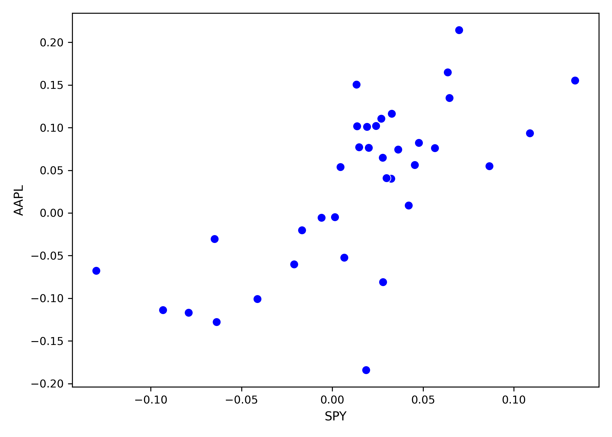
ravix.plot("SPY ~ AAPL + CAT + MSFT + XOM", data = df)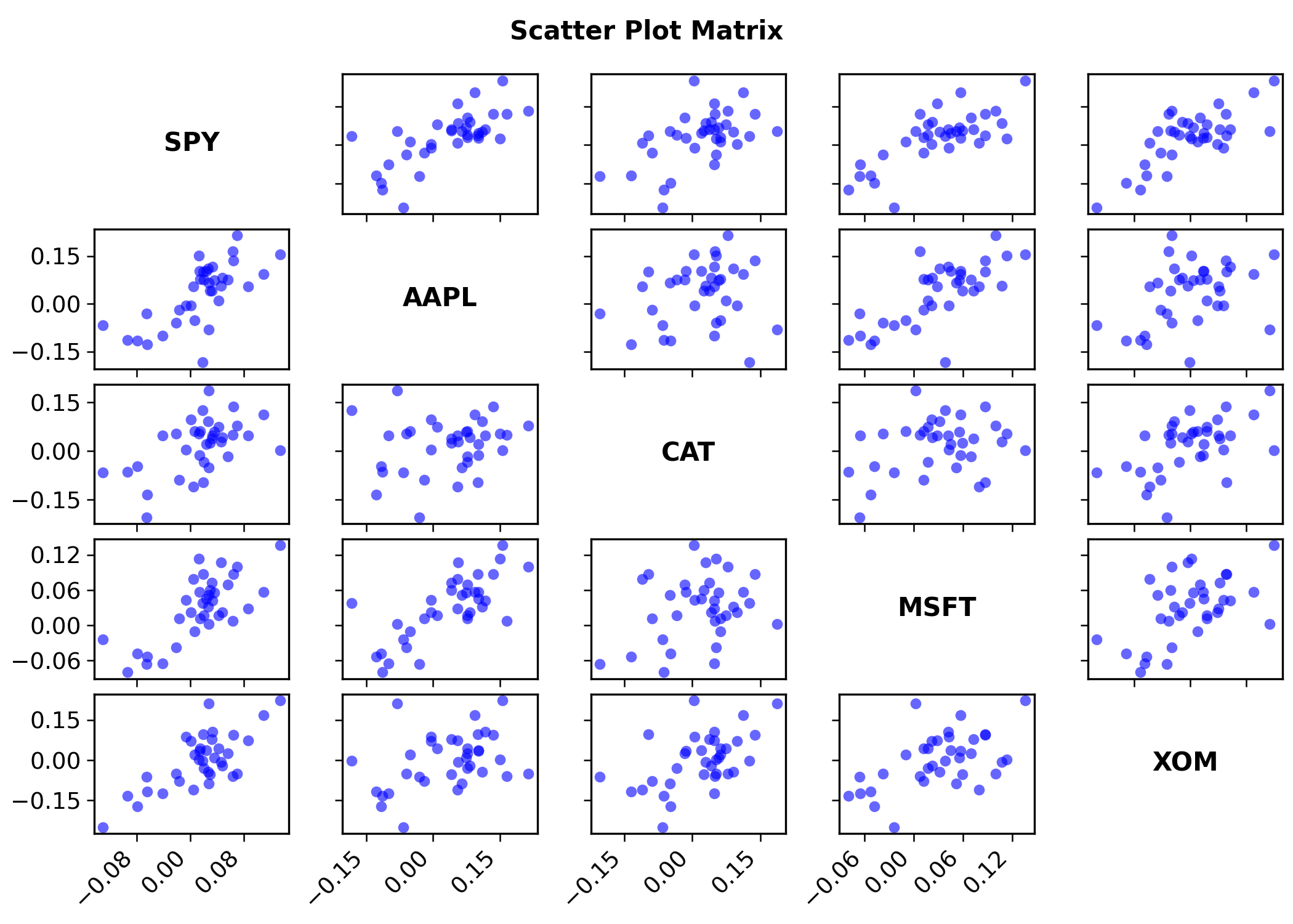
ravix.plot(model)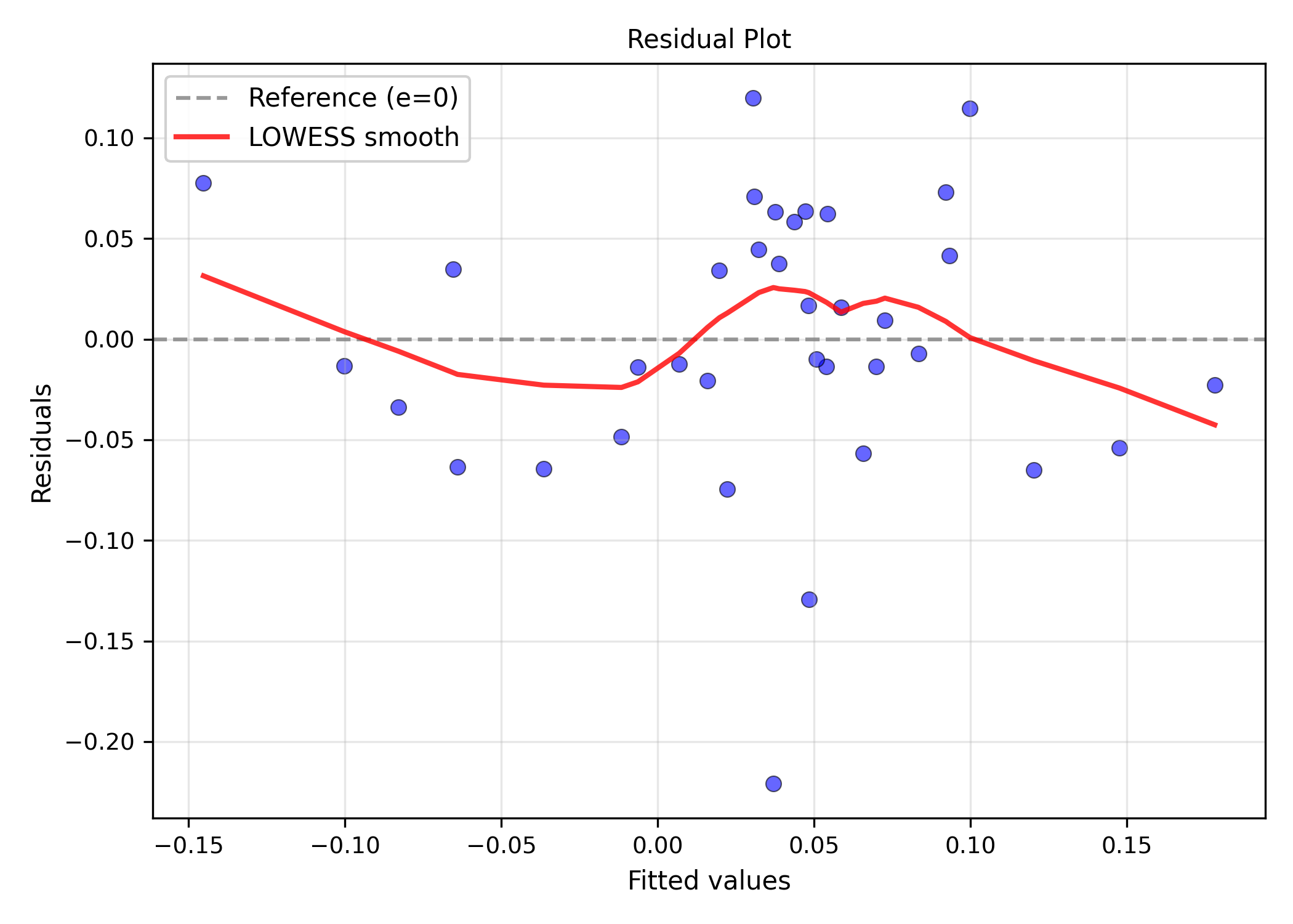
Residual histogram — ravix.hist()
ravix.hist(model, norm=True, bins=25)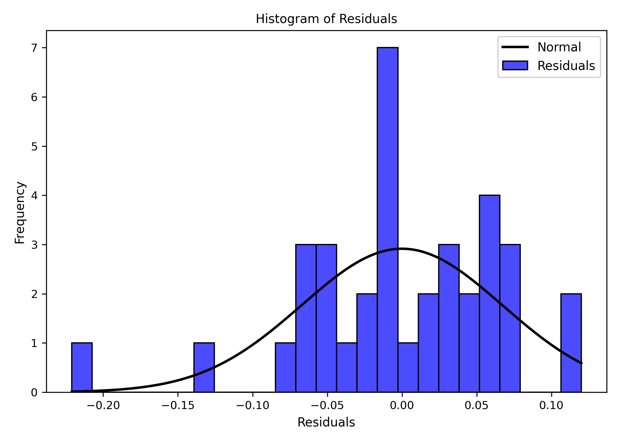
ravix.hist(df["AAPL"], bins=20)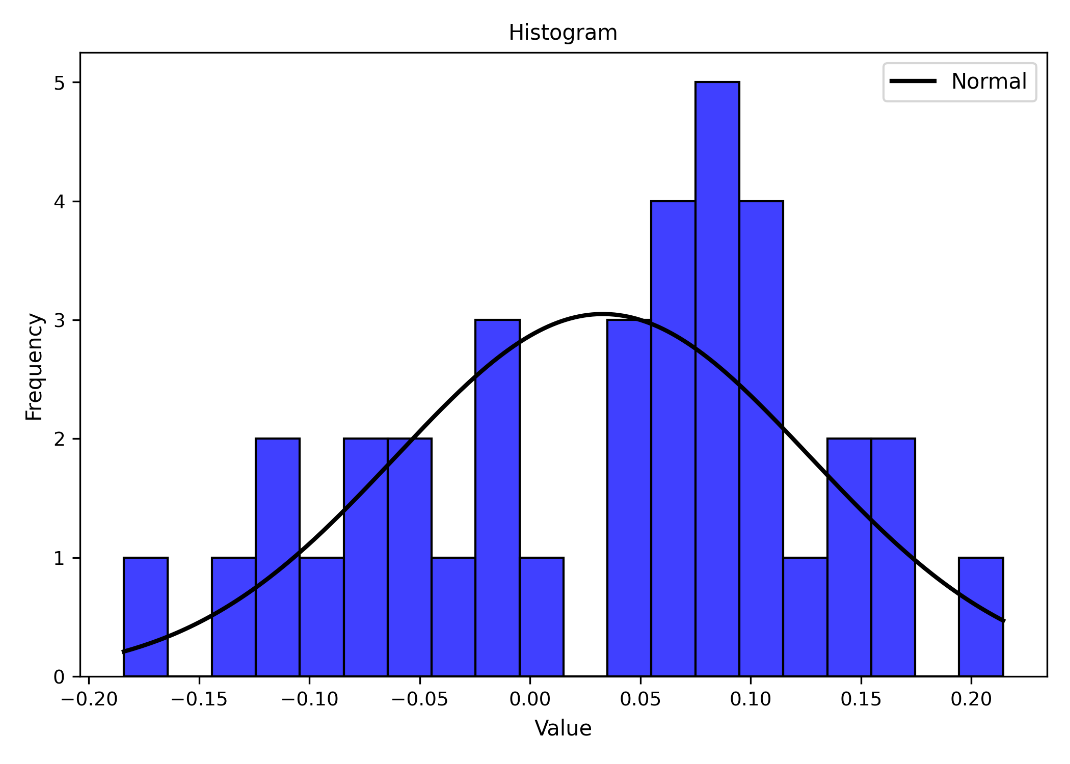
ravix.hist(df)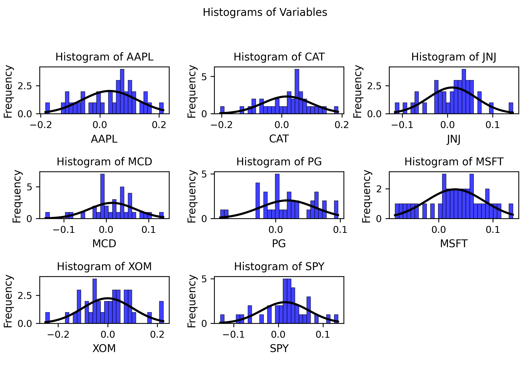
Boxplot — ravix.boxplot()
ravix.boxplot(df["AAPL"])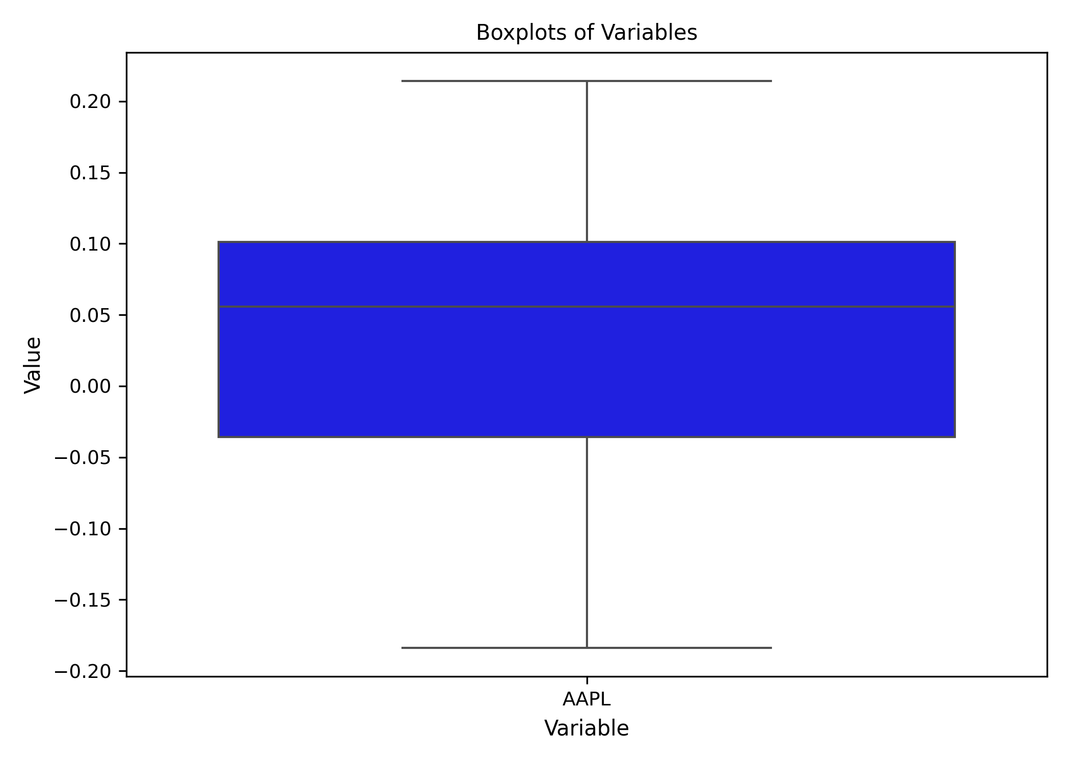
ravix.boxplot(df)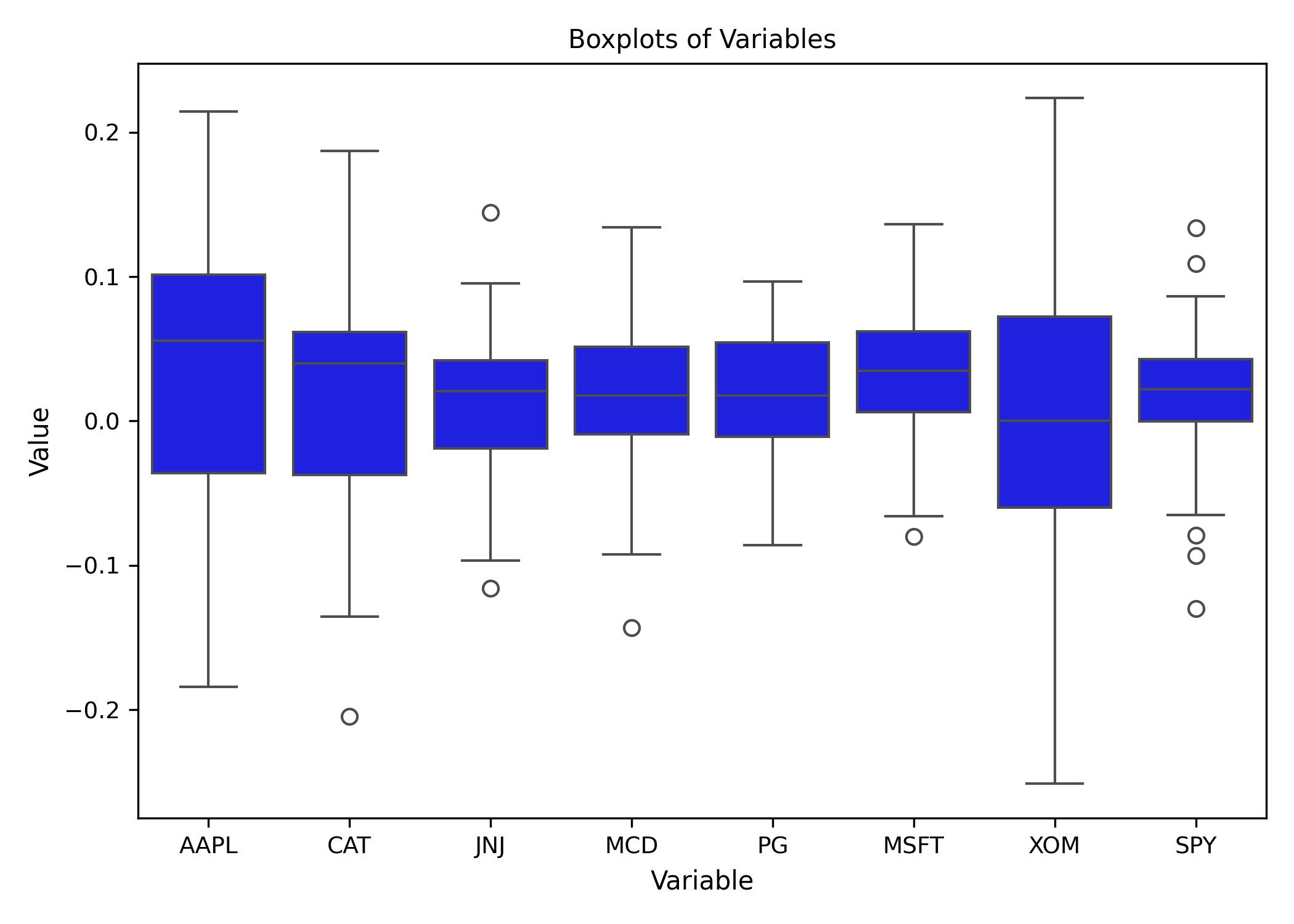
Bar chart — ravix.barplot()
ravix.barplot(df)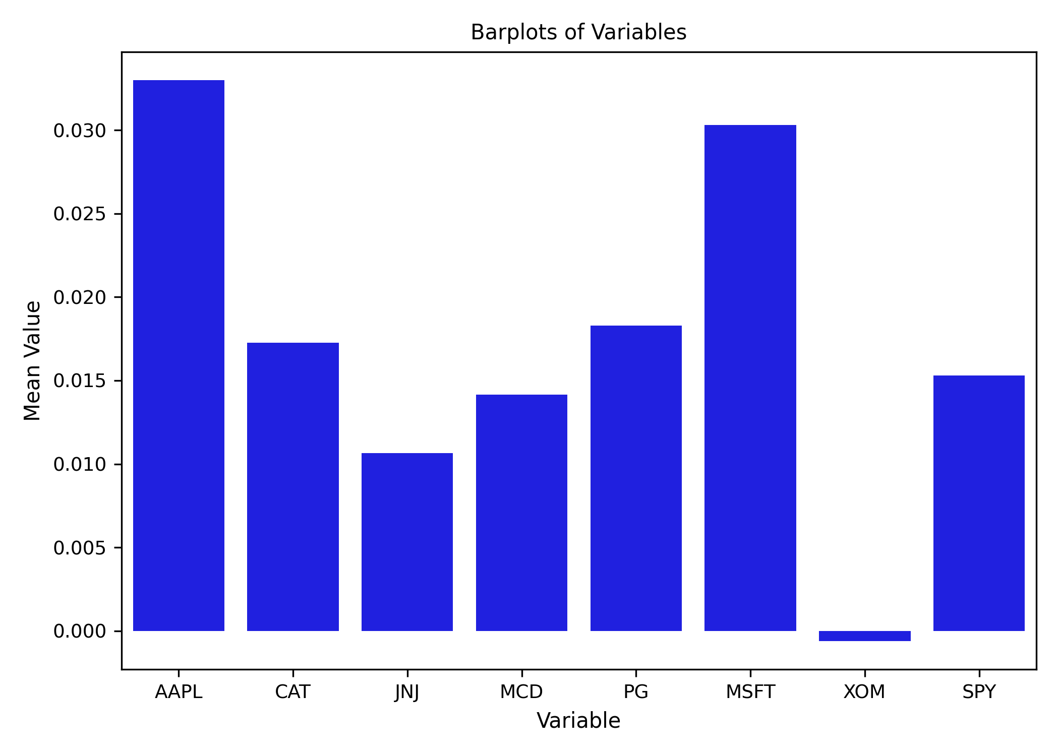
Correlation plot — ravix.plot_cor()
ravix.plot_cor(df)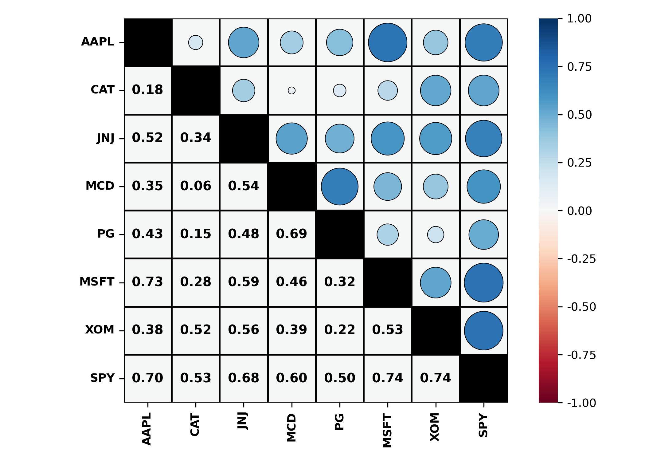
ravix.plot_cor(df, style = 2)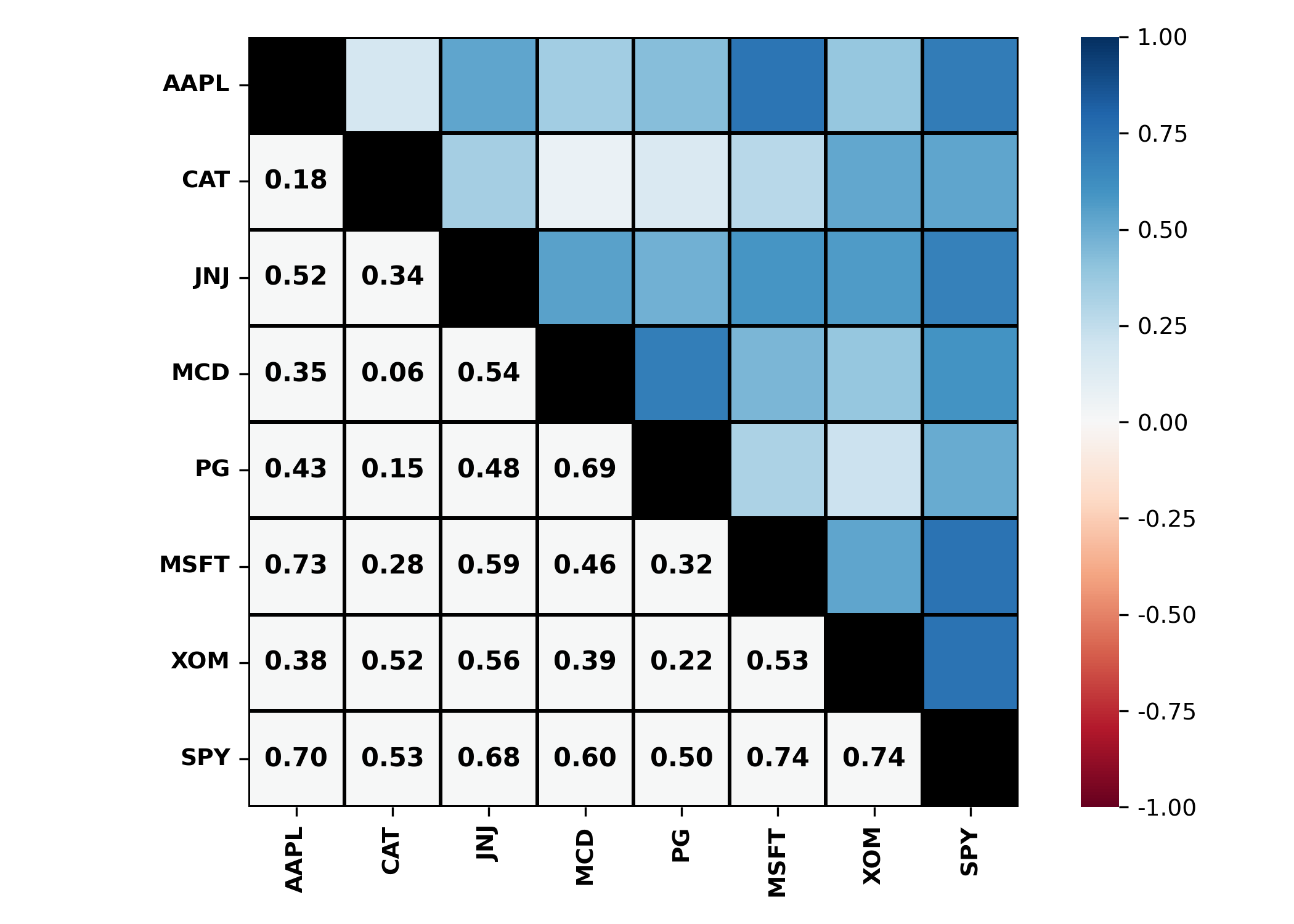
ravix.plot_cor(df, style = 3)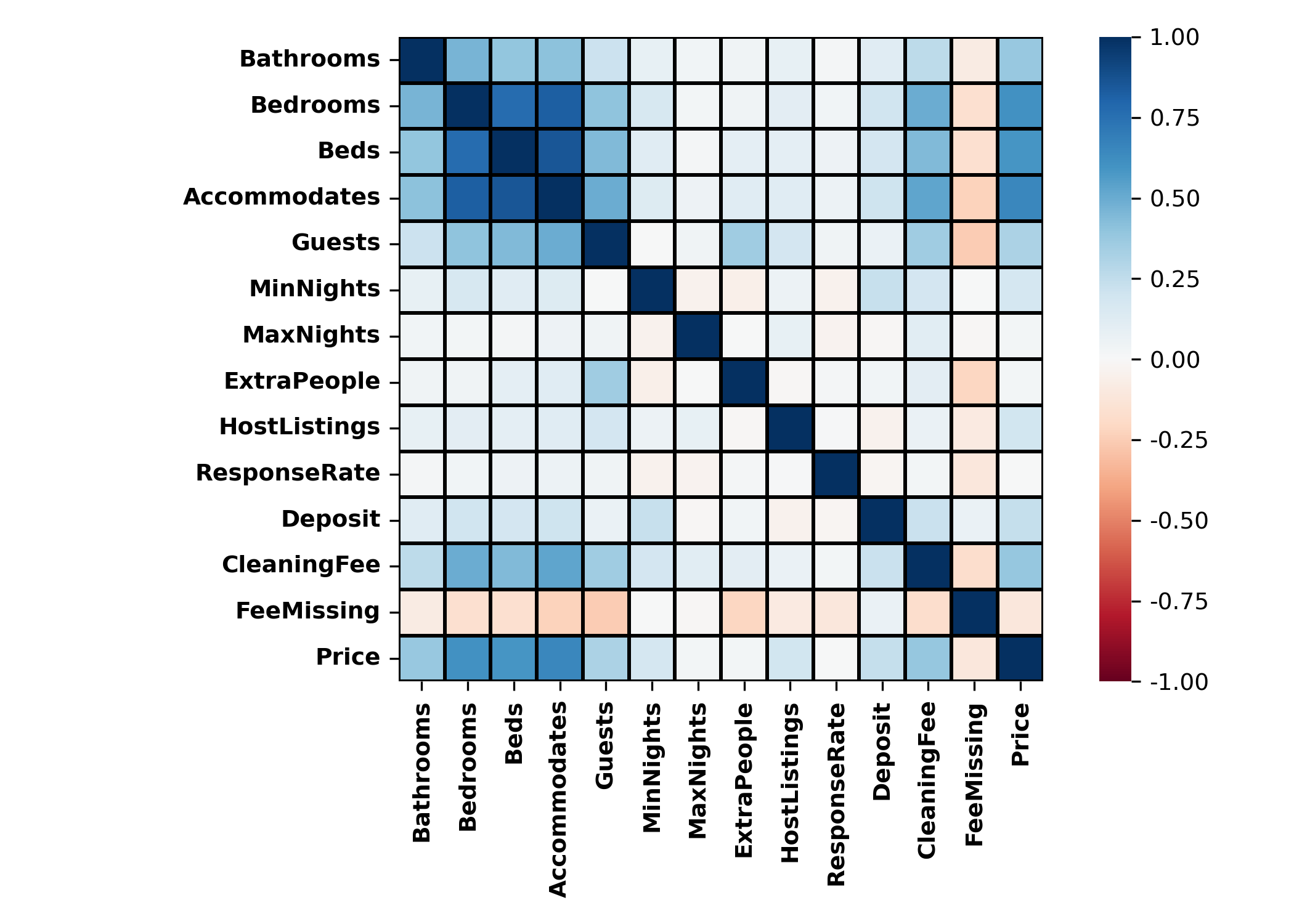
Add a regression line — ravix.abline()
ravix.plot("AAPL ~ SPY", df)
ravix.abline(a=0.0004, b=1.241)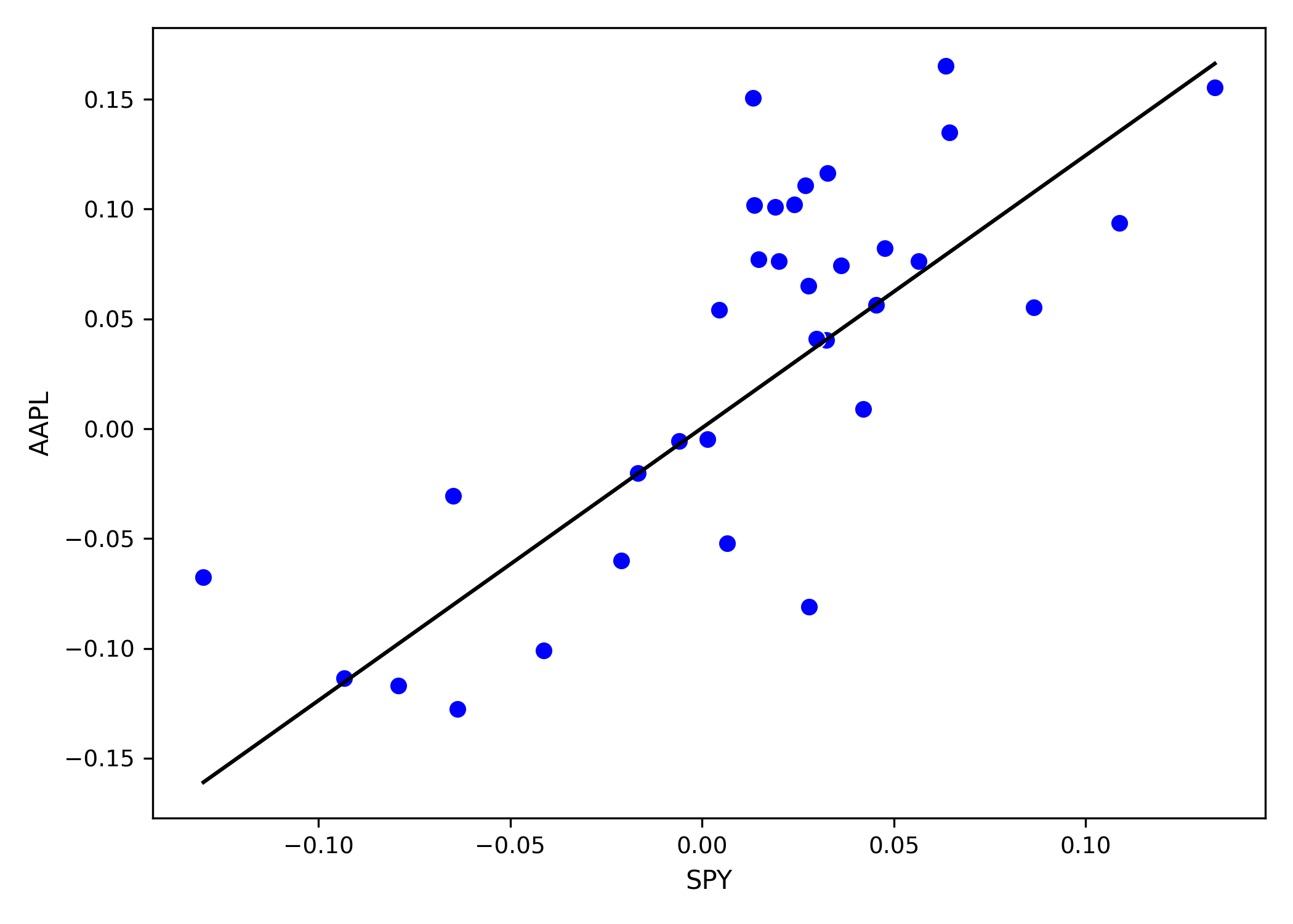
ravix.plot("AAPL ~ SPY", df)
ravix.abline(model, color = "red")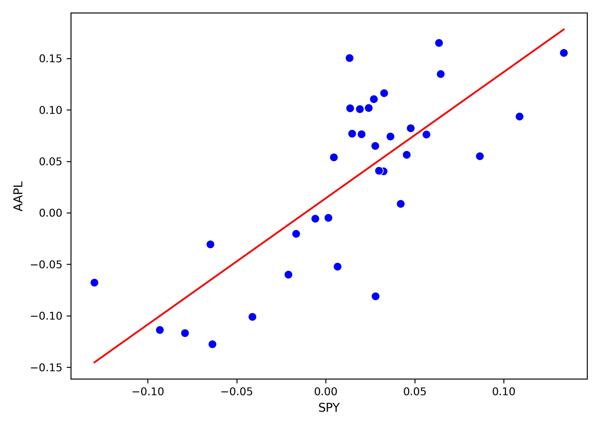
Saving figures
import matplotlib.pyplot as plt

ax = ravix.plot("AAPL ~ SPY", df)
plt.savefig("fitted_line.png", dpi=150, bbox_inches="tight")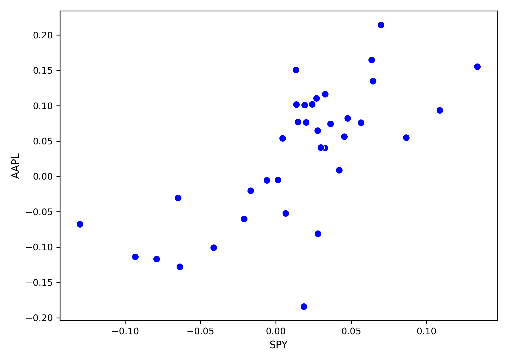
Textbook reference: Visualization is covered in Chapter 2 of Applied Linear Regression for Business Analytics with Python.